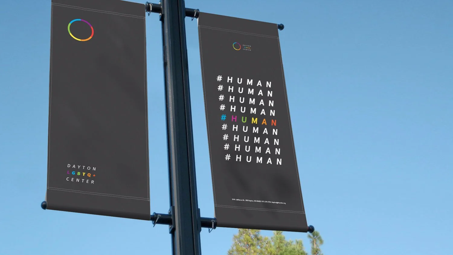
The rebranding project for the Dayton LGBTQ+ Center centers on uniting and empowering Dayton's queer community through a refreshed visual identity that symbolizes both inclusivity and local connection. The design concept revolves around a unified rainbow motif, where each curved color segment seamlessly merges to form a cohesive circle. This circular emblem represents the center’s commitment to bringing together diverse voices and fostering a sense of belonging. The use of vibrant, interlocking colors reflects the spectrum of identities within the community, while the circle symbolizes unity and wholeness.
In addition to the logo, the rebrand extends to various touchpoints including the center’s website, social media, and printed materials. The visual elements incorporate a warm, inviting color palette and contemporary typography, ensuring that the center is perceived as both progressive and welcoming. The imagery of local landmarks and community events is integrated throughout to emphasize the center’s deep roots in Dayton and its role as a vital community resource. This comprehensive approach not only enhances the center's visibility but also reinforces its mission to serve as a hub for support and community engagement.